
How Microsoft Power Platform is helping to modernize and enable...
In this webinar, our experts showcase a variety of demo use cases of how different components of the...
The Update Rollup 5 has brought many amazing features and improvements to MS Dynamics CRM 2011, and one of those amazing improvements has come to the wonderful world of charts! Charts are one aspect of any program that provide a great deal of information. As a matter of fact, charts reveal more than they hide! A quick glance at a chart can tell us a lot more than a detailed scan of thousands of mundane records. So let's take a look at Update Rollup 5 and charts!
MS Dynamics CRM 2011 already provided great abilities to create charts based on so many system entities (Accounts, Goal Metrics, Recurring Appointments, Cases, Phone Calls…and the list goes on!). However, charts before Update Rollup 5 were simple, and they had one certain limitation – You could create a chart based on only one series (vertical axis), and Category (horizontal axis). However, UR 5 gives us the ability to add as many series and categories as we want, thus giving us an even more detailed view of our data, and making decision making easier.
Creating a chart with multiple series is extremely easy. Let us explain that with a simple example. Suppose we want to see all our active customers (Active Accounts) in all the states. In addition, we also want to look at the combined annual revenue of these customers grouped by state. This is what we will do:
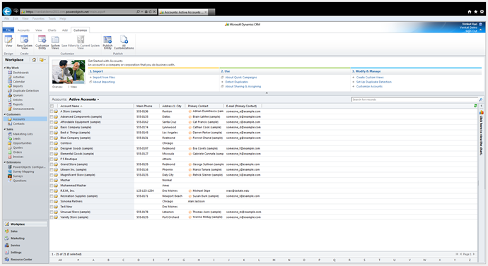
In our left navigation menu, we would go to Accounts, click the "Customize" tab, and Choose Customize Entity.


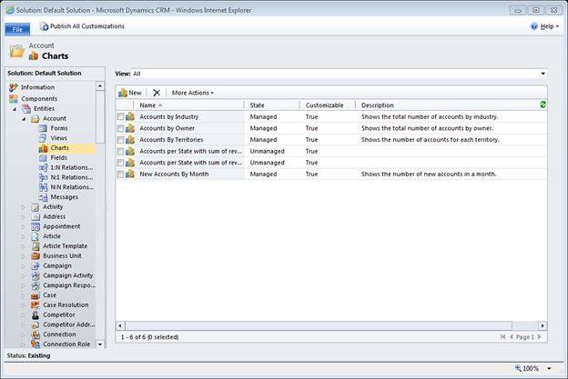
That opens the Default Solution Window. Here we will click Charts, and then New.


On the new window that opens up, we essentially perform four steps.
So, to go with our example, we will first choose Active Accounts from the "View Used for chart preview" dropdown, and enter a name for the chart.


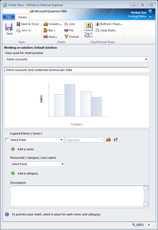
Now it's time to add Series. We would add Account Name first, and for grouping choose Count:All. We also want combined revenue, so we would click "Add a series", and choose Annual Revenue. For grouping, we will choose "Sum". Since we want this data by State, we will add "Address1: State/ Province" in the Horizontal dropdown list.
Note: It is always a good idea to include a description of the chart as well!


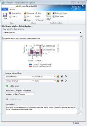
And that's it! You can already see a preview of this chart on this window. Detailed charts look cluttered on this small preview screen, however, you can save this chart and add it to your dashboard to get a bigger/ better view.
If you want to change the type of chart, set Top/Bottom rules (e.g.," show me the top 3 states with maximum revenue"), or delete the series, then you would want to use these buttons:

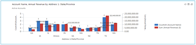
The bigger chart on your dashboard would look like this:
Are there other topics you would like us to discuss? If so, let us know by commenting on this post.
Happy CRM'ing!